Banknote Oddities
Peter Symes
Manufacturing banknotes is a demanding job. Just look at the error notes for sale throughout the world, and it is obvious that mistakes are made. However, not all errors are due to simple printing mistakes. Errors can be due to poor design, poor quality control, or the intervention of the hand of fate. Occasionally errors and mistakes are not quite as straightforward as one might expect.
Errors in the text printed on banknotes are the most common design error on banknotes, and this type of error has occurred on many notes over many years. As long ago as the 1820s, the East Lothian Bank issued a 5-pound note that had ‘LOTHIAN’ misspelt as ‘LOTIHAN’. A modern example of a similar error occurs on a 2,000,000-zlotych note issued by Poland in 1992. On this note the word ‘Konstytucyjny’ is misspelt as ‘Konstytucyjy’(without the penultimate letter ‘n’). In this case, the mistake was rectified and the note reissued.
Similarly, the year of death accompanying the portrait of Josip Broz Tito on the 5000-dinara note issued by Yugoslavia in 1985 was stated as ‘1930’. This was later corrected to ‘1980’. As well as mistakes in the text, incorrect text can be used. Peru issued a 100-nuevos-soles note in 1991 with the name of the man illustrated on the note written as ‘Jorge Basadre’. The name was corrected in a subsequent issue to ‘Jorge Basadre Grohman’.
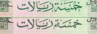
Saudi Arabia has had two notes released with incorrect Arabic text for the denomination; one being a 5-riyal note issued in the 1970s and the other a 500-riyal note issued in the 1980s. In both cases the notes were re-issued with the correct text. The entire series of notes issued by the Saudi Arabian Monetary Agency in the 1980s initially had an erroneous diacritical mark in the name of the issuing authority on all denominations. This mistake was rectified in subsequent issues of the various denominations.
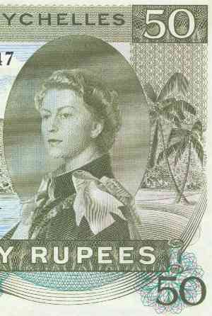
Perhaps the most well-known of all unintentional errors to have occurred on a banknote is the appearance of ‘SEX’ on a banknote issued by the Government of the Seychelles. In 1968 the Seychelles issued a series of notes, which was to become the last series of the Seychelles to feature a portrait of Queen Elizabeth II. The 50-rupee note of this series is dominated by a sailing ship, which appears to the left of the portrait of Queen Elizabeth. In the small space to the right of the Queen are two palm trees.
The unintentional error on this note is that the leaves of the palm trees can be seen to spell the word ‘SEX’. The error became very well known, but the note was never issued with a modified design. The reaction of the Queen to this mistake has never been recorded, if indeed she was ever told. However, Her Majesty was also the subject of another famous error.
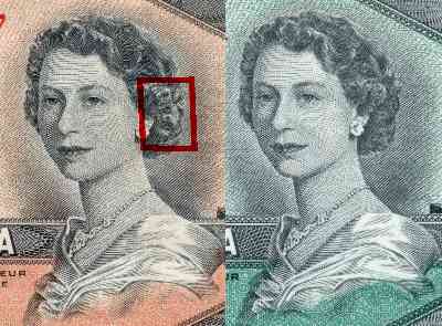
In 1954 Canada issued a series of notes that contained a portrait of Queen Elizabeth II on the front of each denomination. It was not long before it was observed that the Queen’s hair, to the right of her left ear, contained an image that could be interpreted as the face of a ‘devil’. Appearing to have a large nose, the shadow of a thick lip, and two bulging eyebrows, the detection of the image brought some concern to the authorities responsible for issuing the notes. Consequently, in 1955, the banknotes were re-issued with the Queen’s hair redrawn.
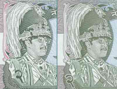
A similar problem occurred on some denominations in a series of notes issue by the State Bank of Nepal in 1981. When the 2-, 100-, 500- and 1000-rupee notes in this series were first issued, a line extended from the lower lip of the King of Nepal, who is depicted on the notes. This line gave the impression that the King was dribbling. The image of the dribbling monarch had such an effect that the notes were re-issued with the line removed.
A third incidence of a fault in depicting a monarch occurred on the 50-baht note issued by Thailand in 1985. On this particular note King Rama IX is depicted with pointed ears, which give him a slightly pixie-like appearance. The embarrassing mistake was soon noticed and the notes were subsequently modified to obscure the pointed tips of the ears.
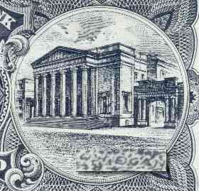
One ‘error’ to have occurred on a banknote was in fact quite deliberate, although it was not known to the issuing authority or to the printer of the banknote. In the 1950s the 1-pound notes of The Royal Bank of Scotland were printed by W. & A. K. Johnston Limited, of Edinburgh. The 1-pound notes of this period had two vignettes on their back, one of the head office of the Bank in Edinburgh (on the left) and one of the principal office of the Bank in Glasgow (on the right).
The design for this note was introduced in 1927 and used for many years, undergoing only slight changes. In the 1950s W. & A. K Johnston decided to redraw the plates for this note. One of the engravers in their employ at this time was Mr. W. H. Egan and, unbeknown to his employers, he decided to leave his mark on the banknotes that he was helping to redraw. So, amongst the pattern of the cobblestones in front of the principal office of The Royal Bank of Scotland in Glasgow he wrote his name. To identify his name, the note must be turned upside down and magnified at the correct point, whereupon the characters ‘W H Egan’ can be clearly seen.
This mystery remained unknown to all but the perpetrator and his family until 1989. In that year Mr. Egan returned to Scotland from the United States of America, where he had emigrated many years before. He presented himself to The Royal Bank of Scotland and asked for examples of the notes on which he had left his mark so many years before. With appropriate good humour the Chief Cashier of the Bank gave him some examples of his work.
For those readers interested in obtaining a sample of one of these notes, the rogue ‘signature’ occurs on the 1-pound notes of The Royal Bank of Scotland with serial number prefix AJ, dated 1st February 1956, to serial number prefix CX, dated 1st November 1967.
Another error in printing can be laid clearly at the feet of the security printer. This error concerns an incorrect line of micro-printed text appearing on a banknote issued in Kuwait. The printer in this case is Thomas De La Rue and Company of Great Britain.
On 20 February 1980 Kuwait introduced their third series of banknotes. At sometime after 1986 slight modifications were made to the notes, one of which was the addition of lines of micro-printed text. On the front of the notes ‘Central Bank of Kuwait’ was repeated in micro-printed English text. On the back of the notes the same phrase was written in micro-printed Arabic text.
Despite the quality control mechanisms of Thomas De La Rue and Company, the micro-printing was not correctly applied to the 5-dinar note. On this particular denomination, the correct micro-printed text appeared on the front of the note, but the micro-printed Arabic text on the back of this denomination reads ‘Central Bank of Yemen’.
Thomas De La Rue had recently prepared a new 20-rial note for the Central Bank of Yemen, which included a line of micro-printing. It would appear that the machinery, which applies the micro-printing to the printing plates, was prepared with the wrong string of text and the text prepared for the Central Bank of Yemen was executed on the 5-dinar note issued by the Central Bank of Kuwait.
The error was apparently never picked up, either by the Central Bank of Kuwait or Thomas De La Rue, as all notes of this type have the error on it. For those readers interested in obtaining an example of this error, it appears on the 5-dinar note catalogued as No.14b in the Standard Catalog of World Paper Money.
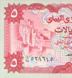
Yemen itself has an unintentional error which is probably the fault of the banknote designers, although the Central Bank of Yemen contributed towards the ‘cover-up’. The mistake involves an illustration and occurs on the 5-rial note issued by the Central Bank on 15 July 1973.
The front of the 5-rial note has an illustration of dwellings built against a steep hill and the Annual Report of the Central Bank of Yemen for 1973 states that the buildings depicted are in the town of Zabeid. However, the illustration is of houses in the Wadi Du’an, which is in South Yemen. The illustration was adapted from a photograph taken by a German adventurer named Hans Helfritz. That an illustration of buildings in South Yemen appears on a banknote issued in North Yemen, seventeen years before the unification of the two countries, is a peculiar mistake.
It is probable that the banknote designers know very little about the geography of Yemen and probably didn’t realize that the photograph was of a village in the wrong country. It is also unlikely that many Yemeni people realized that the illustration was of dwellings in a neighbouring country.
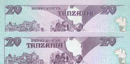
In 1985 Tanzania issued a series of four notes. The design on the back of each note incorporated a map of Tanzania with the name ‘Tanzania’ printed over the map. The problem with the map was that it did not depict the islands of Mafia, Pemba and Zanzibar, all of which are important places in Tanzania. The error was rectified in the following year when the notes were re-issued with the islands included in the map and the name ‘Tanzania’ shifted to the left of the map.
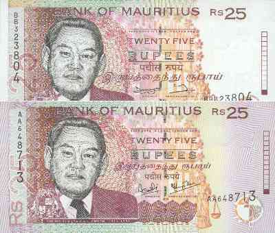
Sometimes a mistake is not a mistake until the note is issued. This occurred in an issue of banknotes by Mauritius in 1998. Until this issue, the denomination had always been written on the banknotes in English, Tamil and Hindi – in that order. The notes issued in 1998 altered this tradition by printing the denomination in the order of English, Hindi and Tamil. Apparently, the change was made because the Tamil text would have encroached on the portrait of Sir Moilin Jean Ah-Chuen on the 25-rupee note, had the usual order been maintained. By changing the order of the text, the Tamil text was kept clear of the portrait and, in order to maintain uniformity, the change was incorporated on all denominations.
However, the change in order almost brought the country to its knees. Within days of the banknotes being issued, Tamils were protesting and burning effigies of the Governor of the Bank of Mauritius, Tamil members of Parliament threatened to resign, and representations were made to the President of Mauritius. Ultimately, the notes were re-issued with the text in the correct order and peace was restored to Mauritius. However, both the Governor and the Managing Director of the Bank of Mauritius lost their jobs over the incident.
One mistake, that never made it into circulation, was on a note prepared by the Bank of England. On the back of the 5-pound notes issued by the Bank in 1990 is a picture of George Stevenson, the famous English engineer. Accompanying the illustrations on the back of the note are the years of Stevenson’s birth and death. The initial print run of these notes was discovered to have an incorrect date and so the entire print run was destroyed. The notes were then reprinted and issued to the public.
This final example shows how close a banknote with an error can come to being issued, before being noticed. That many other notes with errors are issued, such as those described here, is not surprising, considering the number of banknotes that are designed, printed and issued each year. For the collector, these errors (and the notes issued to redress the errors) create varieties that are a delight to collect. On another plane, they are reminders of the fallibilities of the men and women who produce the notes. Perhaps we are fortunate that our personal mistakes are not made available to posterity, as are the errors of the banknote designers!
This article was completed in December 2001
© Peter Symes